
ALTERNATE WORLDS • E-COMMERCE • 2026
The Catalog Heist: Driving Growth Through Systems & User Experience

TIMELINE
3 months — Research, Design, QA
ROLE
Product Designer (Me!)
TEAM
Designers
Developers
Manager
QA Team
Overview
Alternate Worlds is a comic book, collectibles, and pop culture retailer based in Bayswater, Victoria, Australia — with a catalog of 500,000+ products built up over 47 years in business. Alternate Worlds sells comics, graphic novels, manga, trading cards, tabletop and role-playing games, action figures, statues, apparel, and other collectibles, serving both everyday shoppers and serious collectors through its retail store, online storefront, and wholesale channel.

↑ 395%
Feature discoverability
↑ 64%
App logins
↓ 29%
Customer calls
SOLUTION
Here are some of the key flows

Hybrid category landing pages
Instead of forcing every visitor through the same generic browse pattern, nav-driven visits land on a hybrid category page that blends curated collections with filterable product sets, matching how people actually think about the catalog, not how the database is structured.

Faceted search results
Search-driven visits land on a faceted product grid built for intent, not exploration. When someone types "Batman," they get relevant, filterable results instead of a wall of unrelated SKUs.

Series-first product grouping
Products are grouped the way collectors actually think — by series, rather than by internal attribute taxonomy. The product card and series accordion carry that logic through the entire browse experience.
PROBLEM
47 years, half a million products, one problem.
The catalog had grown for decades without the underlying navigation system growing with it. Categories, filters, and search were all bolted on at different points, for different reasons, with no shared logic tying them together.

A user types "Batman" and gets chaos.
A simple, high-intent search — someone looking for a specific character or collectible — returned an unfiltered, disorganized wall of results. Categories didn't behave like categories. Filters didn't behave like filters. Search didn't behave like search.
61% of e-commerce visitors abandon a site if they can't find what they're looking for within five seconds.
The design wasn't entirely wrong — it had worked for years. But the catalog had outgrown the system, and every workaround since then had made the experience harder to trust, not easier.
"I know what I'm looking for and I still can't find it." — user research quote
INITIAL FINDINGS
The rules the old design was breaking
Digging into user behavior and existing patterns surfaced three principles the current experience consistently violated:
Categories are filters, not steps.
Users didn't want to be funneled through a rigid hierarchy — they wanted to narrow down a set on their own terms.
Search ≠ browse.
These are two different intents with two different jobs to do, and the product was treating them as the same flow.
Group by what collectors think, not by internal taxonomy.
Attribute-based grouping made sense to the business, not to the people shopping.
GOALS

Help users find what they're looking for, fast
User goal
Reduce drop-off and recover lost revenue
Business goal

Make browsing feel intuitive, not like work
User goal
Increase catalog engagement and conversion
Business goal

Trust that search and filters actually work
User goal
Build a system that scales with catalog growth
Business goal
DESIGN PROCESS
Working my way down, thinking from a high level structure…
I started with information architecture and the category hierarchy, then moved screen by screen into browse, search, and product pages. The working principle was collector-first: group the way a collector's brain works, then let filtering handle the rest.
Finding areas of improvement in the current experience and trying to stay collector-first during the iterations.
I compared the live storefront to support and sales-floor feedback and walked each path the way a shopper would. When something felt off, I wrote down what was missing: a search that returned noise instead of matches, a category that took five clicks to get through, a filter that reset itself. Those notes became the list of fixes.

BEFORE
Getting to a product list took several pages. Users clicked through a category, then a sub-category, then a results page, sometimes more, before seeing any actual products.

AFTER
The product list lives on a single page. Category, sub-category, and results collapse into one experience, so users see products immediately instead of clicking their way there.
BEFORE
Filtering meant a single, static filter set that tried to serve every use case at once — too much for quick narrowing, not enough for specific searches.
AFTER
Filtering is split by intent: an instant filter bar at the top of the page for quick, common narrowing, and a complete filter panel off-canvas for deeper, more specific searches.
Building out the catalog page with multiple states and edge cases…
I mapped out the user journey from start to finish for the main catalog page, considering all possible states that could impact what a shopper sees. I focused on identifying relevant information to display at a glance: a product image, a short overview, attribute pills, and the publish date inside each series group, and how that would vary depending on how someone arrived at the page.

I did the same for search, except the use-case there was different: a shopper landing from search already knows what they want, so that flow strips out the curation layer and leads straight into a filterable, intent-driven grid — closing the gap that let a query like "Batman" return an unfiltered wall of unrelated results.
Finally, the first version was ready for cross-team review.
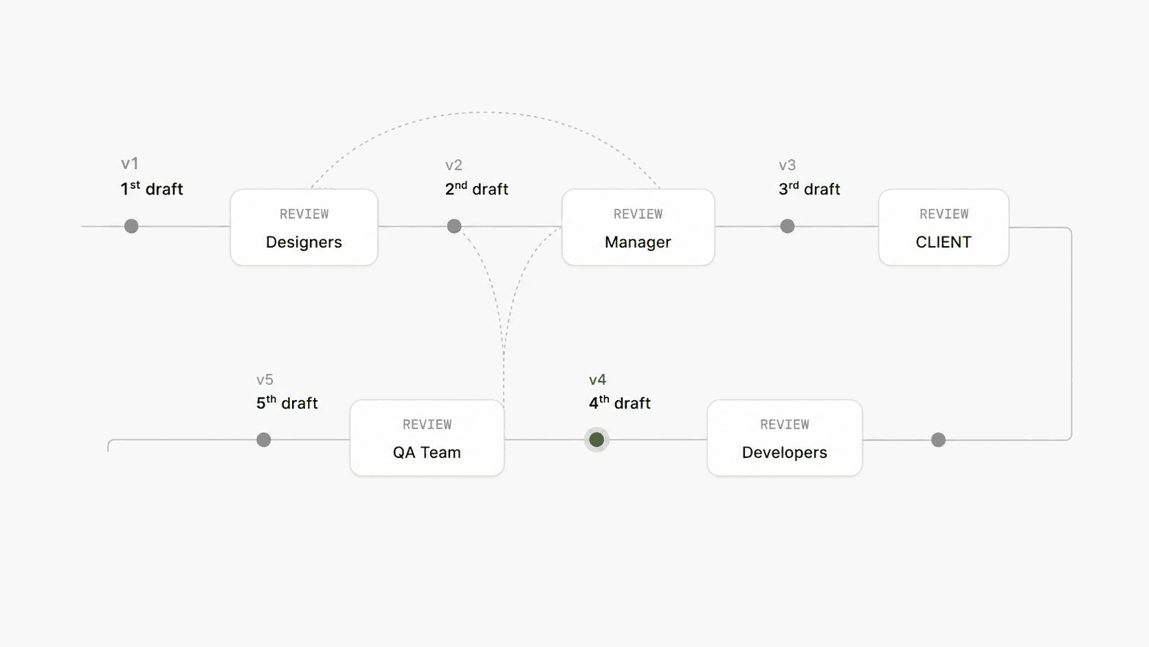
I mapped every entry point that changes what someone sees: nav, search, and direct/deep link, plus the edge states inside each — empty results, a single exact match, partial matches, a fully populated grid, and loading/transitional states. When the set was complete, I took it to the manager, developers, and QA team.
Getting stakeholder buy-in
Reviews and rounds of iterations are hard, but they are key to turning stakeholders into advocates for the work. I knew it was crucial to listen and address concerns, without forgetting we had to be assertive about some of the design direction we chose, and to show the value in that direction.
One way I get buy-in is by showing the direct value and speaking to stakeholders directly. I walked the manager through a simple before/after of how many clicks it now took to reach a product, and the reaction was immediately positive.
DESIGNING WITH TECHNICAL CONSTRAINTS
WooCommerce and the Blocksy theme setup forced me to rethink the design again.
I designed for a fully custom accordion and filter system, but WooCommerce's product query structure and Blocksy's existing theme options didn't support every pattern I wanted out of the box. We adapted the series accordion and filter panel to work within WooCommerce's product taxonomy instead of fighting it, and kept the UI from looking like a bolt-on by matching spacing, type, and component states to Blocksy's own settings.
DESIGN SYSTEM
Adding new reusable components and setting them up for a clean developer handover.
I used Figma AI to help generate first-pass component variants — the series accordion, filter states, and product card — while designing, so I could spend more time refining hierarchy and interaction instead of building every state by hand from scratch.
To keep handover simple, I named every design variable to mirror Blocksy's own theme setting names (color, spacing, and typography tokens), so developers could map a Figma variable straight to a Blocksy customizer setting without translating naming conventions in between.
Figma MCP was connected so developers could pull live component specs and variable values directly from the working file, instead of relying on static redlines that go stale the moment a variant changes.
QA & TESTING
I tested multiple catalog states in staging and evaluated design specifications across various screen sizes to be sure.
I used Claude Code to help run through QA systematically — checking each entry point (nav, search, direct link) against its expected states (empty, single-match, partial-match, fully populated, loading) and flagging layout breaks, truncated copy, and misaligned filters across common breakpoints before the limited rollout.

This project is still in build — outcome metrics aren't available yet.
Once the redesign ships and we have data to measure against (clicks to product, search abandonment, catalog engagement), this section will be updated with real, post-launch numbers.
REFLECTION
My key takeaways and learnings!
Structure before pixels saves rework.
Mapping page types and states to user intent before touching visual design meant fewer surprises later — and a system that could flex as the catalog kept growing.
Naming conventions are part of the design, not an afterthought.
Mirroring Blocksy's setting names in Figma variables turned handover from a translation exercise into a direct mapping — developers didn't have to guess what a token meant.
Where AI fit into this project
Figma AI for first-pass components
Generating initial variants of the accordion, filters, and product card freed up time to focus on hierarchy, copy, and edge cases instead of building every state manually.
Figma MCP for live handover
Connecting Figma MCP meant developers worked off the actual live file and its variables, not a static export that drifts out of sync.
Claude Code for systematic QA Running
QA through Claude Code made it easier to check every entry point against every state consistently, instead of manually retracing each path by hand.
CURIOUS TO KNOW MORE?
This is just a small part of the design process, to get the full story get in touch.